Introduction Integrating security into a widely used platform like GitHub is both a challenge and an opportunity to enhance its...
14 March 2023
Lire cet article en Français
How to Create Your Own Dashboards with Azure Workbooks

This post is one of a series of articles on Azure’s dashboarding feature: Workbooks. I encourage you to read the first part of this series, which talks about this component and the templates built into Azure.
In this second part, we’ll look at how to start with a blank template and create fully customized Workbooks that best show the key KPIs for your project.
As in the first post, this one uses a Modern Integration scenario with an Azure Integration Service (AIS) integration platform as an example.
Creating a Workbook
We’ll start by learning how to create a Workbook in Azure. There is a Monitoring section in the left-hand menu for each component, where the Workbooks are located.
Templates for creating Workbooks can be found in the Quick Start section at the top of the page. There are two templates:
- Default Template: includes a sample query and presentation text
- Empty: a completely empty template

If we select the Empty template, we get a Workbook with no content.

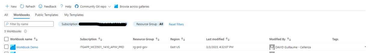
After saving the Workbook, you can find it in the Workbooks section along with all the other Workbooks you have created.
Now that we’ve set up our Workbook, we need to complete it with the different elements we’ll look at below to highlight the various KPIs.
Creating and Manipulating Queries
We can use queries to query the logs we have collected for the component linked to the Workbook.
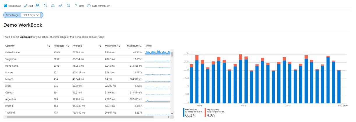
In our example, we will see, as part of monitoring our APIs, where users are calling from, our API response times, and what the call trends have been for each country over the last few days.
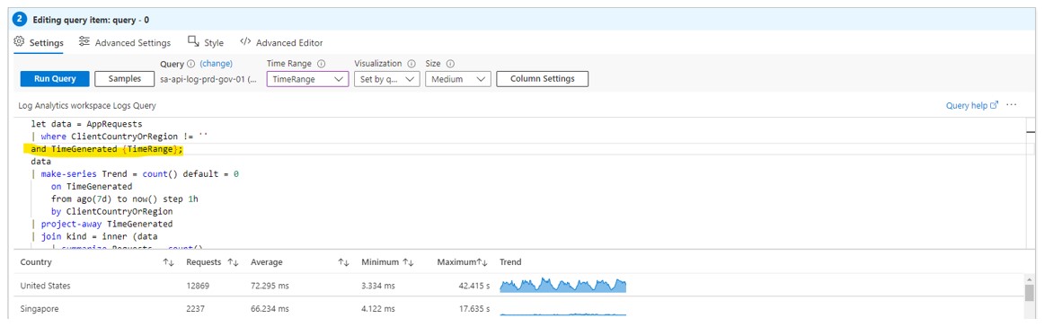
Here is an example of a query that will give us the information we need to expose our KPIs:
This query is performed in multiple steps. First, we use the “make-series” function to create a table of how many calls come in per hour from each country. Then, we do a “first join” to get the total number of calls. This is followed by a second join to get the average, minimum, and maximum processing times, again by country. Finally, the query aggregates all of this data into an output table.
We’ll insert the following into our query:

The result displayed in our dashboard is raw and difficult to read: this is why Microsoft gives us tools, like the Column Settings option, to improve how our results are presented.
The displayed text can be formatted: we will format the durations shown by specifying the type (average, maximum, minimum, etc.) and the unit of measurement (milliseconds here).

We’ll also present our Trend column (which shows the call trend over time) graphically by converting the column into a graph.

All of these modifications make the result much more readable, as shown below:
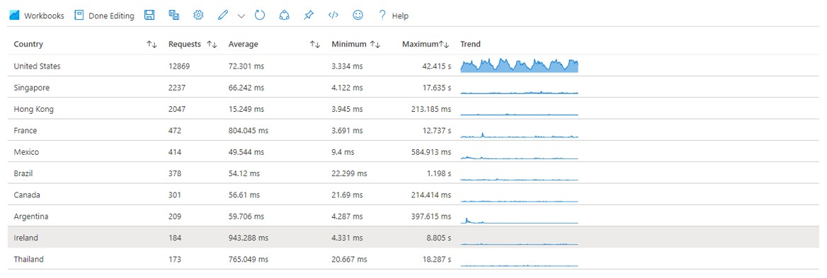
This table shows the incoming call trends for the various countries and their response times at a glance. We can then alter the available resources or their rental based on our API activity.
Let’s look at our other KPI sources: metrics and data based on events within the various components.
Creating Metrics
Metrics record events, such as within the resource consumption platform (CPU, average response time, memory, etc.), or platform health (HealthCheck status, etc.).
In our example, we will show the return code types for our APIs and their number. To do this, we need to add a metric to our dashboard. We then go to Add metric and choose the metric we want to display.
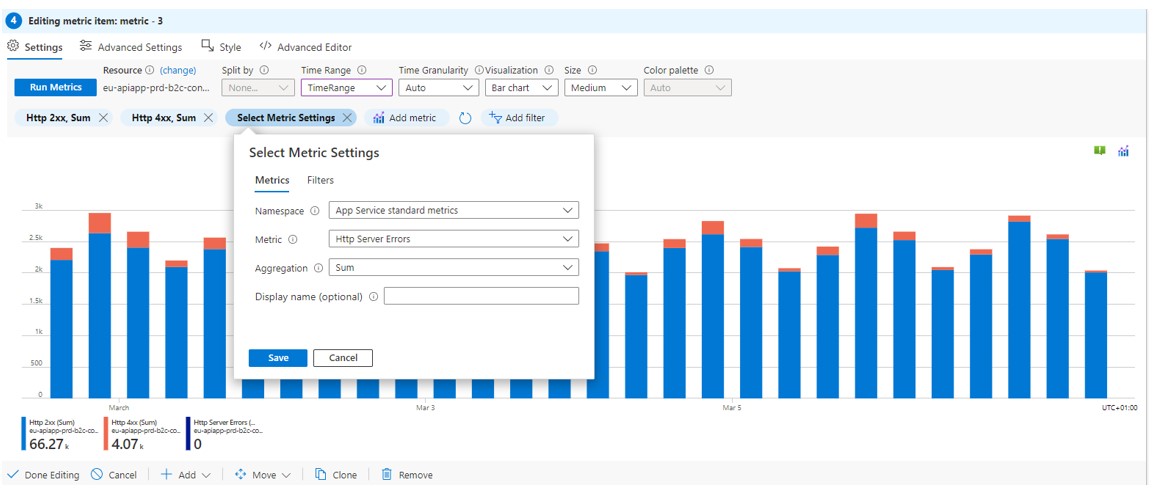
This graph makes it easy to see how often requests to our APIs succeed or fail. If there are many errors, it can quickly show a problem with one of the components. In conjunction with our first graph, it can also be used to monitor how our platform works during peak periods.
Queries and metrics have shown us two tools to display our platform’s key KPIs. Now we’ll look at how to use the parameters and tools for adding text to make the Workbook less static, more interactive, and clearer.
Creating Parameters
We can create parameters that will be used in one or more queries to make the Workbook more interactive.
We’ll demonstrate this by creating a “Time range picker” type parameter. This will let us choose how long our query results will be shown.
To create the parameter, select and click Add parameters. A pane opens where you can enter the name, type, and other settings, such as whether the parameter is required or its possible values.

After saving the parameter, we can use it in queries. Going back to our previous example, we need to add the time range parameter as follows:
Now that the parameters have made our Workbook more dynamic, we’ll work on making it easier to understand by adding text (for explanations, examples, and comments) and formatting it to make it easier to read the KPIs in the Workbook.
Manipulating Text
First, let’s look at how to add text to explain our dashboard. To do this, we need to choose the add text option at the point in the Workbook where we want to insert text and then write the text we want: this could be a title, an explanation, a comment, etc. You can also use the Preview option to see how the text will appear.

We have to use markdown for formatting. Read the full instructions to learn more about these options.
Now that we’ve talked about and added all of the Workbooks’ main features, the one we’ve used as an example throughout this article looks like this:
Azure Workbooks: Key Takeaways
In this article, we looked at the different ways blank templates can be used to show key KPIs, such as the health of your platform or the data being processed.
This post concludes our series on Azure Workbooks, which lets you set up a comprehensive suite of dashboards showing the key KPIs for your projects and the health of your ecosystem in Azure with a lightning-fast time to market. Although this dashboarding solution is only available to people with access to the Azure portal, we consider it a key tool for implementing dashboarding to monitor platforms. This is due to its numerous features and how easy it is to set up because this component is already built into many Azure components.
Want to learn more about this topic? Read our other articles in this series:
- Monitoring in Azure: How to Automate Log Analysis and Set Up Alerts
- Azure Workbooks: Azure’s Integrated Dashboarding Tool
Contact us if you would like help with your digital transformation from our experts.